Get your free 16-step guide to perfect on-page SEO
Make Google fall in love with your content
61 percent of marketers say improving SEO and growing their organic presence is their top inbound marketing priority.
If you've ever published anything on the world wide web, you'll know how important it is to get your search engine optimisation right.

How to maximise meta-descriptions
The often-overlooked meta description is a major player when it comes to SEO. You'll learn how to optimise it, and why it's important.
.svg)
How to make the most of links
The right kind of linking is the bread and butter of any SEO guru. Whether internal or outbound, you'll know what to do with links.

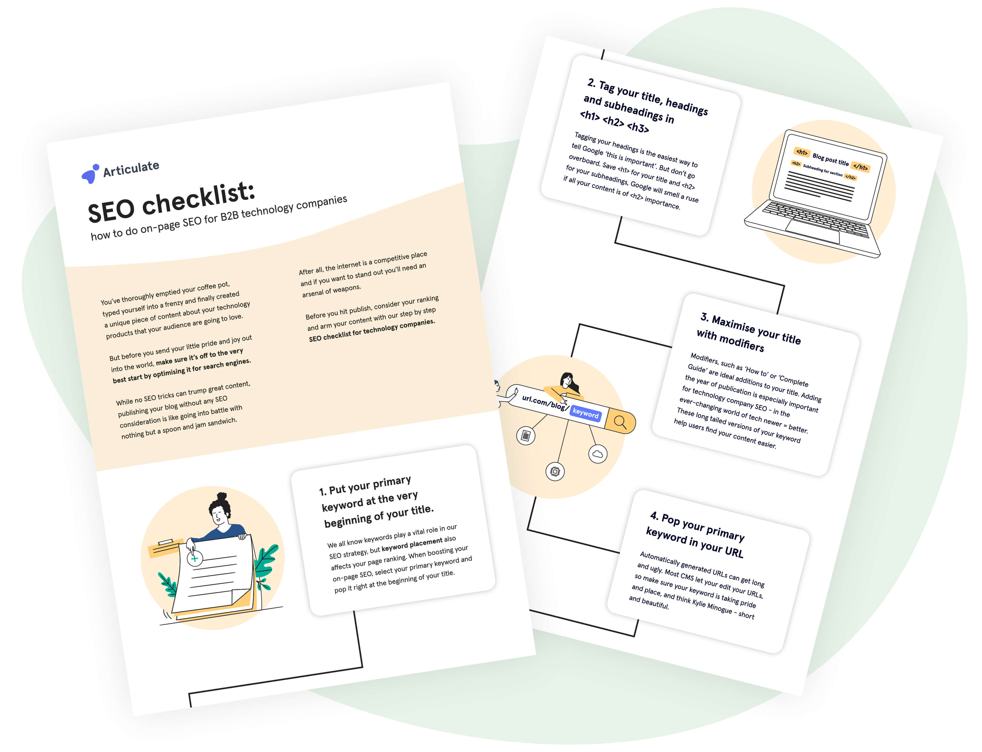
The all-important keyword
Keyword distribution and placement is fundamental to a successful SEO strategy. We tell you where to put it, and why.