
Pick stock photos like you pick dates: with a bit of discretion. It's key for website optimisation and, well, your content deserves better company. Be choosey. Make your excuses to ‘Man smiling with laptop’ and let ‘Group high-five’ know that you’ve decided to see other people.
You need to find stock photos that engage your audience and serve your website well. So, abandon the generic and set off in search of the authentic.
You’ve worked hard to create the content – don’t do it a disservice by using a photo that doesn’t improve and elevate it. The right image can do just that: content with a visual element regularly gets 94 percent more views than text-only posts. Here’s how to choose a stock photo that doesn’t suck:
Quality matters
Blurry photos don’t make sense if you’ve created high-definition content. Using a pixelated image is a quick way to turn off visitors to your site. It looks unprofessional and devalues your work. Sourcing high quality images isn’t difficult. With loads of stock photo websites out there, there’s simply no excuse.
Testing a photo on your site before you publish it will let you ensure that it’s the right size and format for the page. Once it’s up, don’t forget to check for the impact it has on website optimisation using Google’s PageSpeed. If it puts a dent in your speed, try using image compression sites like Optimizilla or Kraken.io to fix the problem. Check the license
No stock photo is worth a lawsuit. Avoid taking the lead role in a cautionary tale by checking the licensing on the image you want to use. Ensure it is royalty free and available for commercial use. Sites like Flickr will explicitly detail how an image can be used, while others like Pexels and Unsplash only feature photos that are royalty free.
Optimise your images
Choosing the right photo can also boost your search engine ranking. Whatever you choose should be accompanied by keyword-rich alt-text so your photos will show up when people use image search for topics you want to rank for.
Make it relevant
A blog post about artificial intelligence with a photo of a kitten in a meadow doesn’t work, unless the kitten is a robot. Make sure your images are relevant to the content you’re offering, or visitors to your site will leave as quickly as they came.
A recent study showed that the average online reader only spends 15 seconds on a webpage before leaving it – if your photos don’t match your offering, visitors will follow this trend. There are billions of photos online and available for use, and there will be one that suits your page. Don’t take the easy way out, though. Spend time and find an image that you haven’t seen countless versions of in the past, or one that offers an interesting context for your page’s subject.
Think outside the topic
Finding a photo that suits or enriches your content doesn’t have to mean looking for something literal. You’re better off using an image that elicits emotion in your reader than one that is generic, as you’ll create a visual connection and memory in visitors’ minds. Use some lateral thinking and be creative in your choice of photo. Make an impact.
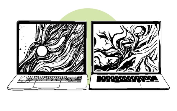
Writing about cyber-security? Consider looking for pictures of locks or safes instead of a bland shot of a laptop. Better yet, find a photo of a laptop in chainsfor an evocative addition to your post. Creating tangible associations in your readers’ minds is a fantastic way to make your content memorable – especially when it comes to writing about tech.
Get creative
There’s nothing stopping you from making your own images, either. If you find a stock photo that you like and want to add to it, graphics and illustrations can elevate the visual elements on your page and ensure they align with your existing branding. Looking for photos that share a colour palette with your website can be a helpful means of narrowing your choices and making the search easier, too. Introducing some consistency to your images can make your organisation memorable for its ‘look’. Comedy works
Don’t be afraid of humour. If you can find a pun in your title that a photo could highlight, get that photo! Research has shown that social media users across America are more likely to share something that they find funny than something they see as important. Over half of them want to see more jokes in advertising.
A dash of comedy can humanise your organisation and get your posts seen by more people. Engaging, funny or unusual images are more likely to get clicked on and shared, so it’s worth taking the time to consider your choice. Picking a stock photo that doesn’t suck isn’t hard. It is, however, something that requires more attention than it is often given. Thinking creatively about your choices will result in more shares and more exposure for that blog post you worked so hard on. Make visual memories for your readers.
Take it from neuroscientist Daniel Glaser:
‘A picture can trigger a buried memory and recall a precise moment in time much more rapidly than words.’
Do you want that memory to be ‘Man smiling with laptop’, or something better? A more important question might be whether you want your visitors to associate you with bland content or exciting, surprising, funny and insightful work. Stock photos have the power to make or break a webpage, so take the time to be choosey.

We recommend reading these articles, next...

Why accessibility is crucial for website design
Uncover the importance of inclusivity, compliance with regulations, and the benefits of simple,...

5 of the best B2B FinTech websites
Learn from the best of the best FinTech websites, and discover how you, too, can have a stunning...
What makes a simple website vs a complex or large website?
You need a new website. But do you need to pay for a complex or large site build, or does your...